Colour Coding Technet Comparison Tables
Posted on August 30, 2018
- and tagged as
- javascript,
- technet
Looking at the Microsoft Technet Office 365 Service descriptions, which provide very nice tables showing the feature support between various Office 365 plans, it’s very difficult to see an overview of where differences lie at a quick glance. Being a visual person, the comparison tables could use some colour coding.
Normally this would be a minor inconvenience that I wouldn’t bother trying to fix it, let alone making a post about it, but I’ve been spending a lot of time looking at these tables, and have found myself re-writing this several times, so it’s here for future copy & pasting.
This is what the tables normally look like, a huge black and white collection of Yes/No cells.
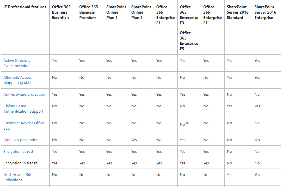
This is fine if you’re looking for one specific feature, but if you’re looking for a quick overview which highlights the differences, it’s not great.
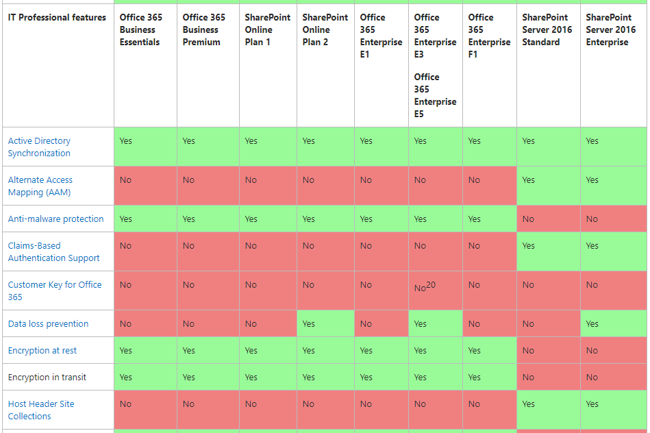
However, we can apply some of our own colour coding using the JavaScript console.
document.querySelectorAll('td').forEach(e => {if (e.innerText.substring(0,2) === "No") {e.style.background="#f08080"} else if (e.innerText.substring(0,3) === "Yes") {e.style.background="#98fb98"}})Which applies colour coding to the table and immediately points out the differences.
Edit: Before browser extensions became all the rage, there was an old way to crate buttons in browsers which ran custom JavaScript, but for the life of me couldn’t recall what they were called. It finally came to me - bookmarklets! If you prepend the code about with javascript: and add it as a pinned bookmark, you can get the colour coding by just clicking the button.